Y’a Bon French Bakery
Brand Identity
Signage
Client: Moïse and Andrea Cerson
VISION:
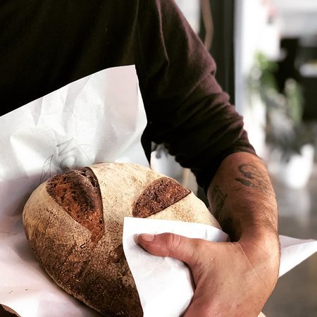
Andrea and Moïse first captured the public’s attention when they offered their “taste of authentic France fare” in a tiny converted tearoom in Greytown’s main street in Wairapa. After many years they made a bold decision to move north to Hawke’s Bay, they were attracted by the Hawke’s Bay Farmers’ Market in Hastings and the region’s fresh produce. Fresh Designs was brought in at the beginning of their Hawke’s Bay journey to develop their brand identity at that stage it was a small café and bakery in Havelock North.
The couple’s new café business, quickly outgrew two sites. In 2017, they opened the doors on a wholesale artisan bakery with an adjoining subleased café in three converted shops on Hastings’ main street.
The sleek premises have helped regenerate an out-of-vogue city block, and have been a source of revitalization for the couple. They are now able to concentrate on their baking operation without the complexities of running a hospitality business.
The bakery showcases the best of Hawkes Bay living through a French lense. Their aesthetic reflects the way they work and live, the things that are important to them: simplicity, quality and community. Huge glass windows frame the bakery work space allowing views of bakers in action from the adjoining cafe Cupple. A small deli section is the place to go if entertaining, gifting or just for the love of good food. The Bay's best Sourdough, fresh baked pastries all in one stylish location.
PATH:
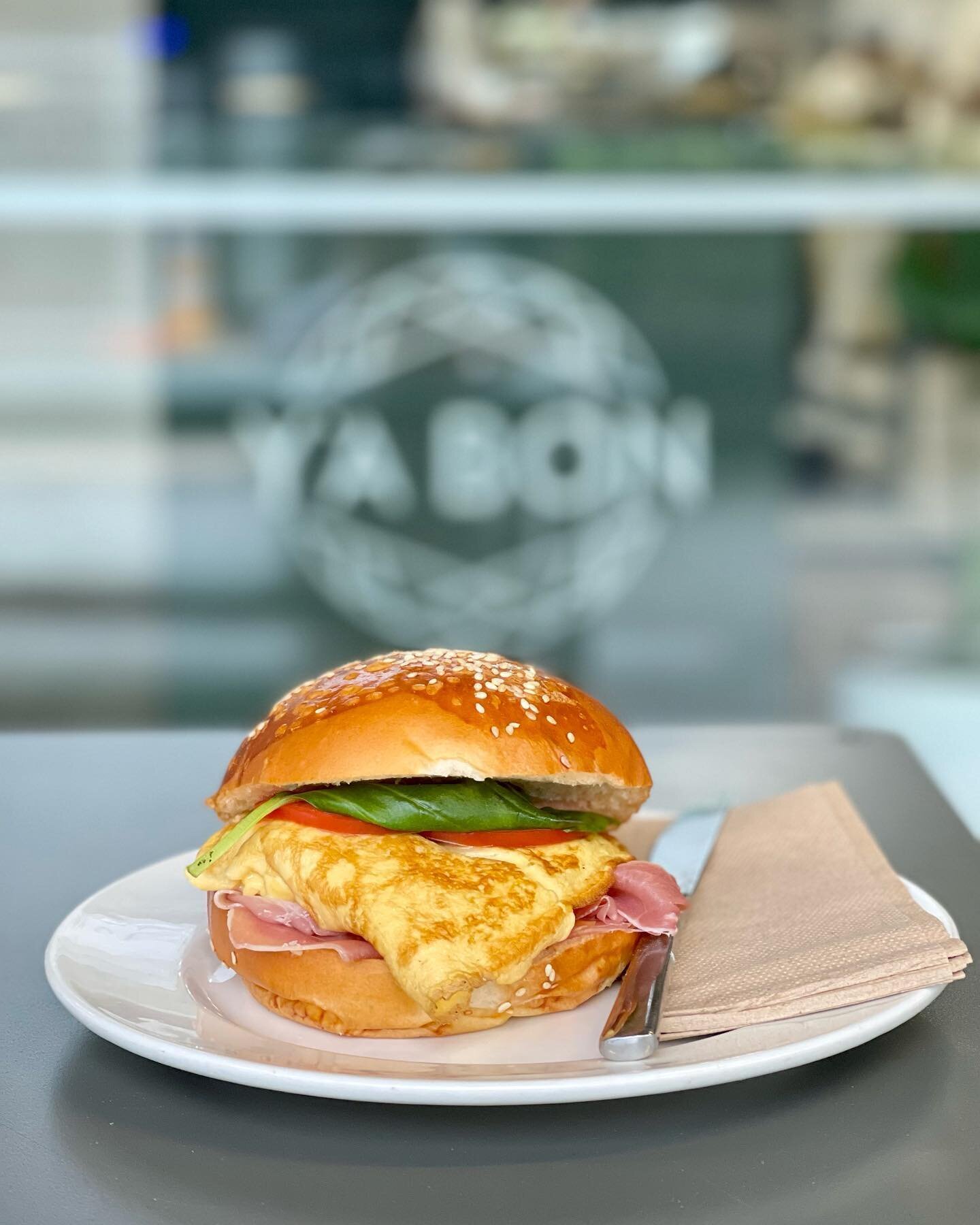
The name Y’a Bon is a Créole expression and a nod to Moïse’s heritage. It’s the equivalent of the French colloquial expression “c’est bon” and translates as “it’s good”.
The brand needed to be timeless to be able to last the growth of the business. The design was inspired by the craft and hand made nature of the bread and pastries. In particular the layering and folding that goes into making the croissant dough as well as the pastries and breads. The geometric lines also convey the sense of science that many people don’t realise is associated with bread and pastry making. The final geometric design has a definite French nod to the geometric lines of the Eiffel Tower in Paris. The circle and mirror images of the logo convey the sense of community and care taken in all that they do, with the name in the centre conveying a welcoming, safe environment to come to.


