Telegraph Hill Olivery
Working with Sonya on the Telegraph Hill brand refresh was a delight. Sonya put serious thought into understanding the brief and the requirements that needed to me met. Her systemised approach meant we were able to roll out the new brand design efficiently and quickly, with good communication between sonya myself and our labelling company. Sonya took ownership of delivering the work to schedule, clearly her experience in her work is vast, resulting in a no surprises process.
I’m very happy with the result, we were able to retain our on shelf brand recognition as product labels changed, this meant we kept existing customers with us for the change and brought on new customers with the improvements.
I totally recommend Sonya and Fresh Designs for graphic design and branding work.
GEOFF CRAWFORD
PATH:
Since 2001 Telegraph Hill has been producing award winning olives & olive oil & hand crafting innovative condiments, sauces & drizzles. Foods that nourish & sustain our bodies, free of artificial preservatives, colours or flavours. Telegraph Hill can be found in Hawke’s Bay on the East Coast of New Zealand, an area blessed with fertile soils and a warm, temperate climate. The perfect ingredients for it’s award-winning gourmet products.
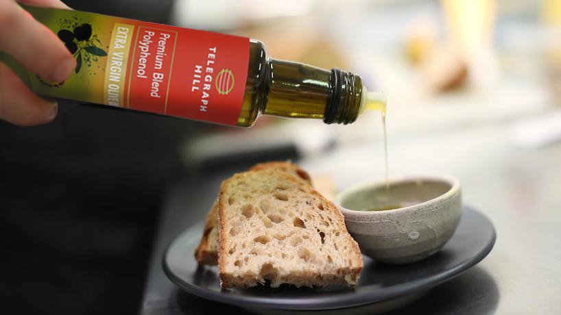
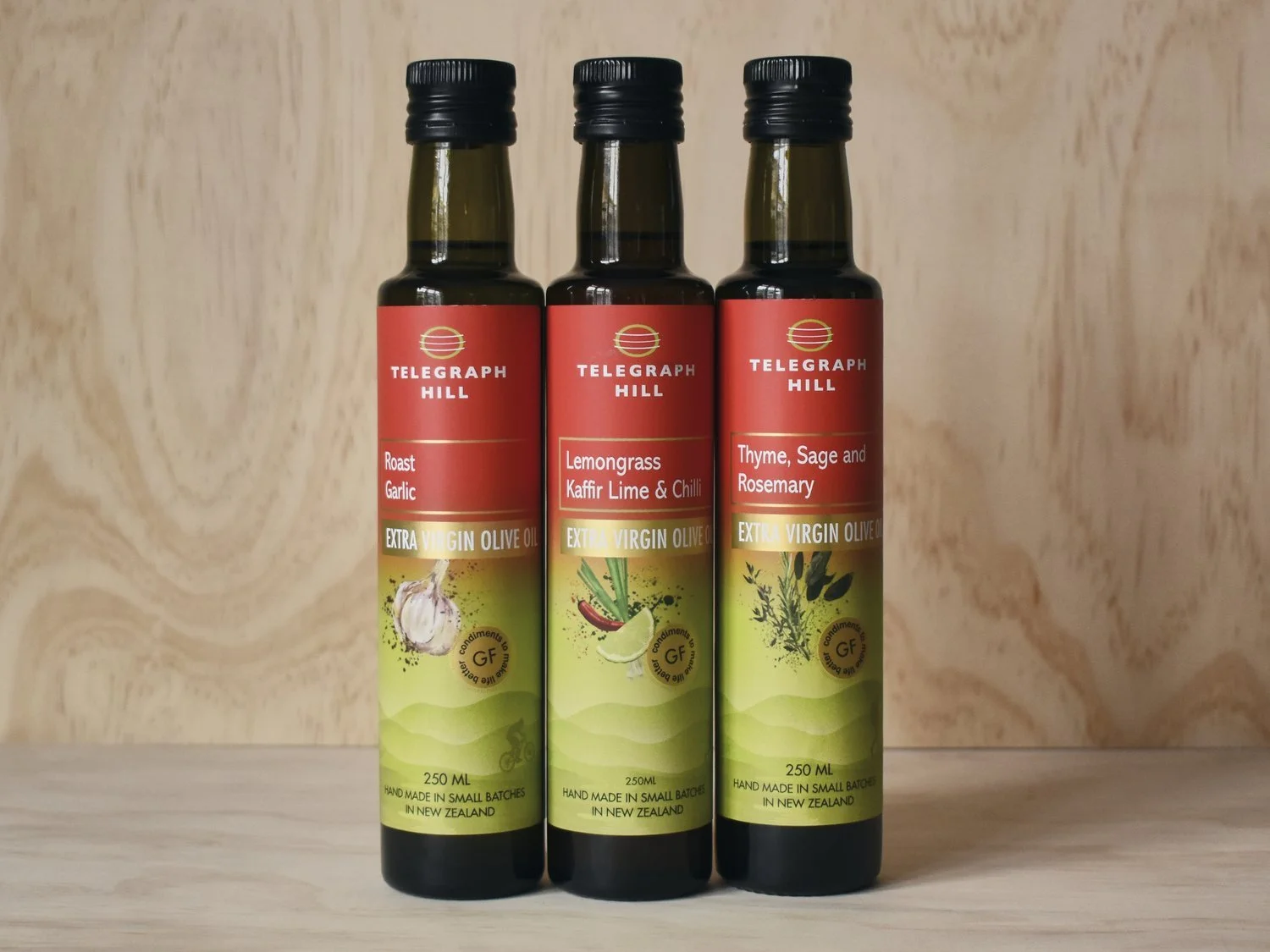
The colours of the packaging take inspiration from the magnificent sunrises over the Hawke’s Bay, one of the first regions in the world to see the sun rise. Shades of which are also reflected in ripening olives. The hero colour, is the eye catching red of the sunrise as well as the Telegraph Hill logo and brand colour. The gradient fills are a reflection of the infusion and blending that occurs in making the products, resulting in depth of flavours.
The sunrise is also apt for the new products being released, symbolising new beginnings as well as the purity of the ingredients. Sunshine, warmth, it inspires, it energises, it renews, much like the products.
The subtle imagery on the packaging takes it’s inspiration from Telegraph Hill and it’s first grove as well as the natural landscapes and wide open spaces particular to Hawke’s Bay and New Zealand.
VISION:
The project is a complete refresh of the Telegraph Hill label so that it is contemporary, reflects the brand truths, the premium quality of the products and is identifiable as Telegraph Hill while still standing out on the shelf. Specifically to rebrand the Telegraph Hill products and develop a brand story. What was essential was that the existing Telegraph Hill red brand colour remained. Label design needed to be modern, bold, playful, friendly, feminine, upmarket, consumer focused and colourful. The new branding needed to still sitting comfortably alongside the existing products with existing branding while the rebrand was rolling out over a few years. It was also important to use a colour palate and ingredient graphics to help the consumer differentiate between the product categories. The rebrand was rolled out across the extensive range of different pouches, bottles and jars over a few years.


