Ant Moore a+ Wines
Label Design
Packaging Design
Logo Refresh
Collision Strip Window Manifestations
Tasting Notes and Marketing Collateral
Client: Ant Moore
Vineyards certified by the Sustainable Wine growing New Zealand™ program
VISION:
Like their namesake, Ant Moore wines are free spirited.
As a winemaker, Ant is an experimenter, a creative oenologist who sees – and does – things differently.
Ant has a holistic growing philosophy and regenerative agriculture practices that see sheep grazing the vineyards to reduce any chemical inputs; a minimal sulphur approach and age-old pruning and canopy management techniques that are gentler on the land.
Ant Moore wines are born in the beautiful valleys of Marlborough in New Zealand’s South Island. The vineyards are proudly certified by the Sustainable Wine growing New Zealand™ program.
At the Kaituna, Casey Road and Patriach vineyards, wetlands have been developed and waterways fenced off, and more than 1000 natives have been planted around the river at Kaituna and the dam at Casey Road.
Kaituna is also home to a queen bee rearing site.
Recently Ant built an industrial scale worm farm to break down winery waste and purify water. The Biodynamic Aerobic (BIDA®) System catalyses the digestive power of worms and microbes to remove up to 99% of wastewater contaminants within four hours. The worms generate water, soil and carbon credits from fine Marlborough liquid wine-waste.
From the introduction of wild ferments to the elimination of fining and barrel aging his Sauvignon Blanc, there is care and consideration in every Ant Moore wine that is usually reserved for wines well above their price point.
The Awatere, Waihopai, and Wairau Valley soils and stones create unique vines that are distinctive to the Marlborough region. With these perfect conditions, Ant and his team are meticulously crafting a mix of science and art.
PATH:
We were tasked with redesigning the existing leaf label design for new tier of Ant Moore a+ labels to work across 5 varietals with the possibility of more being added to the range. At the same time we modernised the logo. Cartons as well as tasting notes and marketing collateral were also designed. The design needed to exude the free spirit that Ant is know for. The final design perfectly conveyed the mix of science and art that the winemaking team convey in the wines.
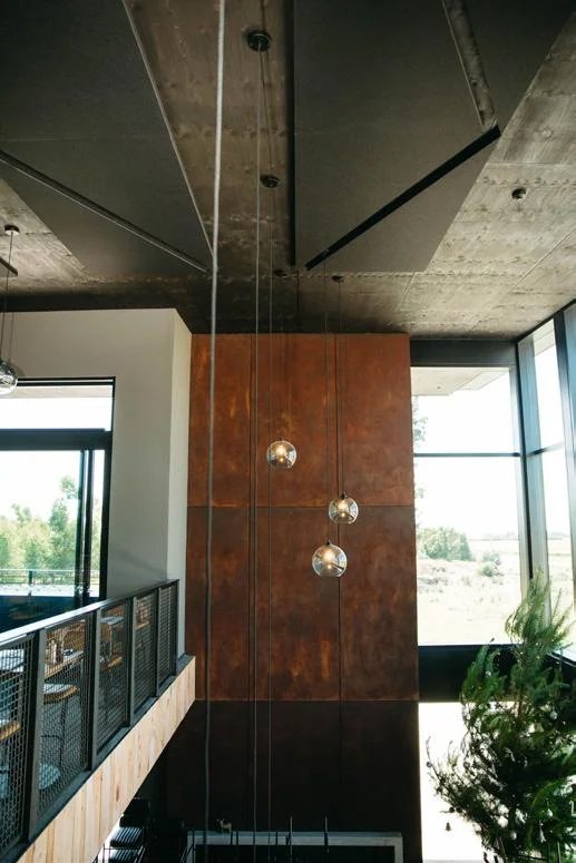
The triangle pattern was a huge success and was also used by the architects on the ceiling panels and on the new winery windows as collision strip manifestations. We were tasked with designing it as an organic repeat that runs along the sliding doors of the restaurant. In addition we were tasked with designing an enlarged version of the triangle pattern to be used as a pattern on the windows of the offices to create privacy between meeting rooms and offices.


