Moffett Honey
Brand Identity
Illustration
Packaging
Client: Kellie Moffett
Honey that is 100% pure, raw and untreated.
VISION:
To create a label and logo for a honey to be branded under the Moffett name. Moffett Orchards is an old family business that specialises in growing and producing apples and melons. Their fruit production has been complemented by beehives for a number of years, but it is only now with the 3rd generation helping to collect the honey and look after the bees, that they have chosen to release the honey under their own brand name. They want to introduce honey lovers to the delicate and complex flavours of their individual honey varietals. The first release of their honey has been bottled and harvested from one site, but in the future, it is hoped other site-specific honeys will be released. The honey is 100% pure, raw and untreated.
They approached Fresh Designs to design packaging that would reflect the pure, artisan quality of the honey and thus differentiate their honey from the mass produced, treated honey available in supermarkets.
PATH:
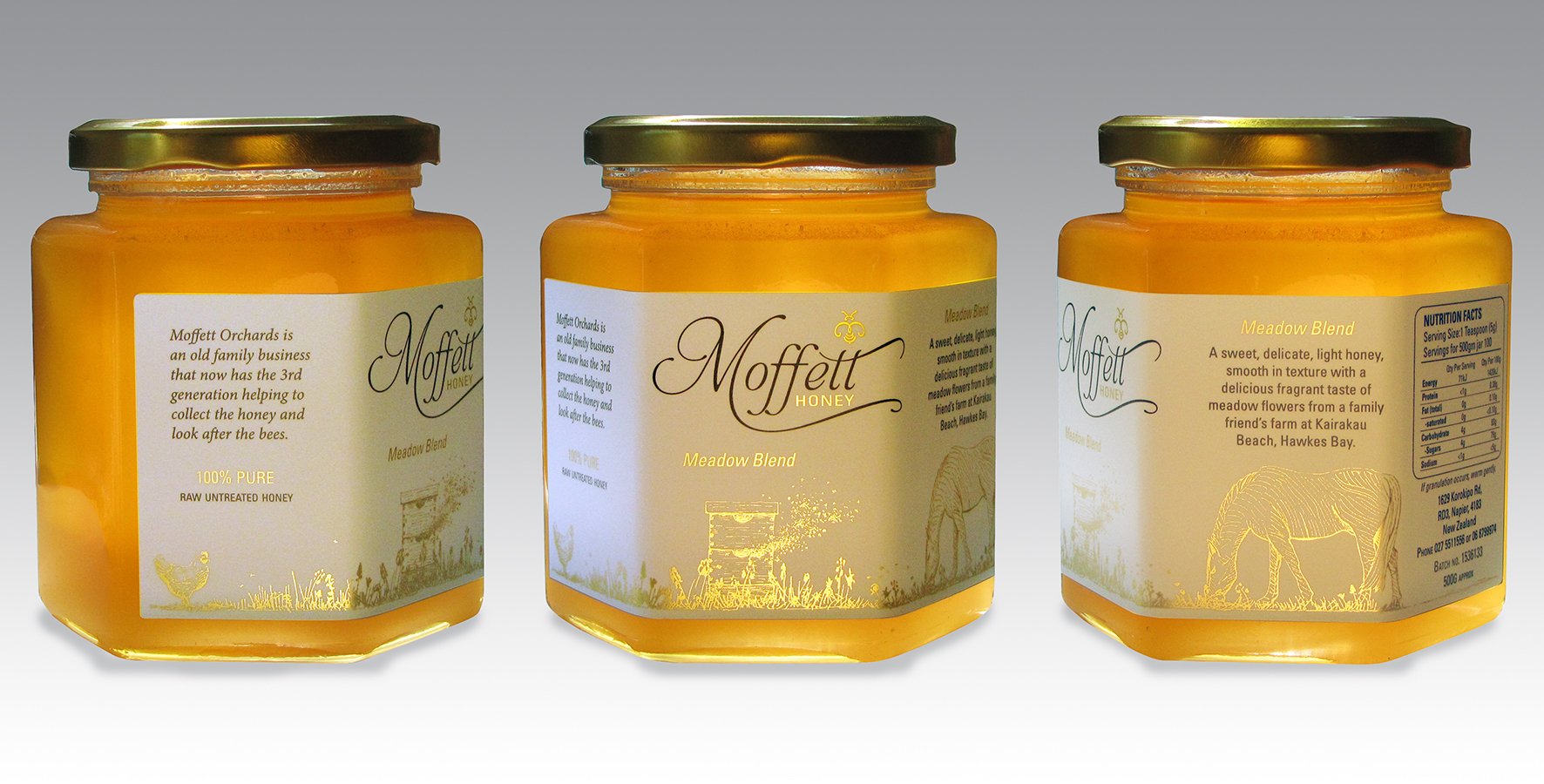
The surname ‘Moffett’ originates from a place name in Scotland, 'Moffatt'. The place-name is derived from the Gaelic words magh and fada, which mean long field. This meaning was the starting point for the concept behind the design. The hand drawn, illustrative style chosen reflects the artisan nature of the product.
The width of the label was used to illustrate a 'long field' that for each different honey released will be specific to the site that the honey comes from. This first release is a Meadow Blend from their friend’s farm.
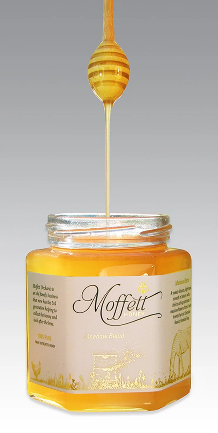
The illustration not only pictorially depicts the site the honey comes from but evokes nostalgic memories of relaxing summer days. The wrap around label invites the consumer to pick up and rotate the jar to view the entire illustration.
Each new honey released will have a different horizontal illustration that corresponds with its site and wraps around the jar.
The logo has long, flowing script to mirror the long field concept as well as the natural flow of honey. The bee's wings are a twirly 'm' for Moffett. The metallic foil label enabled the use of a reflective gold in the design. The honey is to be sold through delicatessens and gourmet food stores.
The resulting label is both sophisticated and high end and will look great left out on any table top.


