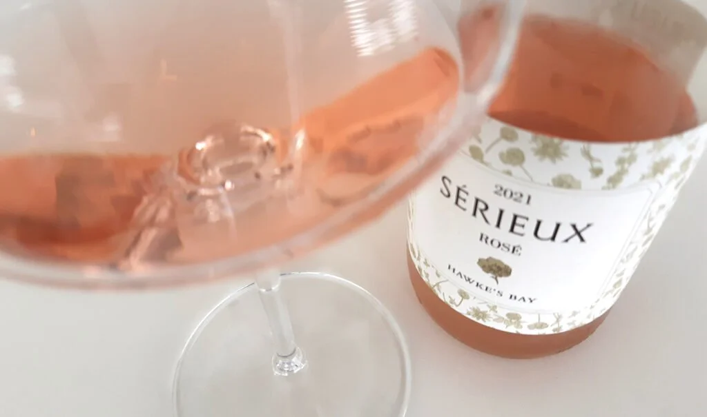
Fleurty and Sérieux Rosé wines
Packaging Label Designs
Illustrations and Patterns
Client: Askerne Wine Estate
Askerne Vineyards are certified by the Sustainable Wine growing New Zealand™ program
VISION:
A pair of new Rosé wines from Askerne Wine Estate. Fleurty Rosé is playful and fun with spritz and Sérieux, as its name suggests, was made in the French style and is more serious and dry. Both are delightful and floral which inspired the label designs.
Playful and fun, the packaging and pattern captures the pretty, light hearted floral qualities of the wine. Perfect for the Summer - think picnics in a field of wild flowers...
PATH:
The brief was for label designs that worked as a pair, could be seen to come from the same producer, whilst visually showcasing the difference in style of each Rosé. Beautiful summer drinking wines that conjure up fields of wild flowers. A pretty floral pattern was chosen that worked beautifully in full colour and adapted well for the more serious Provençal style when printed in a bronze colour ink with a pearlescent finish. Neck labels were an affordable way of bringing the pattern up onto the capsule.


